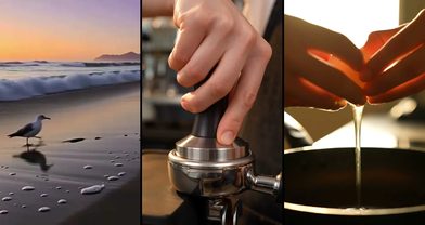
9:16, 16:9, 1:1: The Aspect Ratio Cheat Sheet for Every Placement
The same clip in the wrong frame is a wasted render. Which ratio wins on TikTok, Reels, YouTube and feed — plus how to compose for vertical without cropping anything.

Scene select — 4 scenes
A great render in the wrong frame is a wasted render. We see it every week: a gorgeous 16:9 landscape clip cropped into a vertical ad, the product sliced in half, the caption covering what is left. Ratios are not an export setting — they are a directing decision. Here is the whole map on one page.
Match the frame to the feed
- 9:16 — TikTok, Reels, Shorts. The full phone screen. This is where ad money lives.
- 16:9 — YouTube, web heroes, TV. Cinematic by default; the frame film language was built in.
- 1:1 — feed and catalog. Safe everywhere, exciting nowhere. Use it for product tiles.
- 21:9 — trailer moments. Letterbox drama, on the Seedance 1.5 Pro and 2.0 Fast tiers.
Every flagship video model in the studio — Seedance 2.5, Veo 3.1, Kling 3.0 — renders the first two natively, and the composer shows which tiers each one takes before you spend. That is the shortlist worth memorising, because it covers every placement you will actually buy.
Compose for vertical
Vertical is a different lens, not a smaller one. When you render 9:16, think in columns: one centered subject, stacked foreground and background, motion that travels up and down instead of across.
Center-weight the subject
Vertical crops punish wide staging. One subject per frame — two people side by side is a 16:9 luxury. Say so in the prompt: “centered close-up”, not “wide establishing shot”.
Leave headroom for the interface
Platform captions, handles and buttons eat the top and bottom fifths of the screen. Anything that has to be read — a product label, a price, a face — belongs in the middle three fifths.
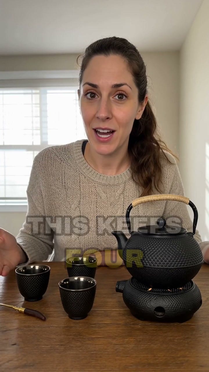
Notice what the vertical frame is doing: the subject sits dead centre, the action travels up the frame rather than across it, and the top and bottom fifths carry nothing you would miss under a caption bar.
The cheat sheet
- TikTok / Reels / Shorts ads → 9:16, 15s, hook in the first 2s.
- YouTube pre-roll → 16:9, brand on screen by second 5.
- Instagram feed → 9:16 renders and let the feed frame it; a 4:5 still from an image model covers the taller in-feed slot.
- Homepage hero → 16:9, loopable motion, no critical text in frame.
- Product catalog → 1:1, centered, clean background, logo-safe corner.
One brief, every ratio
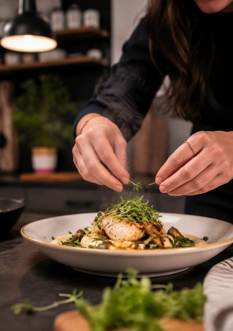
The pro move is rendering the same beat in each ratio instead of stretching one master. In the composer, duplicate your prompt, switch the ratio, and adjust the composition clause — “centered close-up” for 9:16, “wide establishing” for 16:9. Two renders, two native frames, zero cropping.
A barista pulling an espresso shot, centered close-up, glossy commercial style, camera tilting up from the cup to her face, warm counter light with steam rising through the frame, unhurried morning pride.Run this prompt →
A barista pulling an espresso shot, wide establishing shot of the whole counter, glossy commercial style, slow lateral track past the machine, warm morning light raking across brass and steam, unhurried morning pride.Run this prompt →
Take the structure from the six-beat formula, change the composition clause, and the same idea lands twice — once for the phone, once for the page.